Here is another inspiring look from the Wickes paint catalogue:
This look is called Global Village and we hope to create something similar on the window wall of our bedroom.
Colours in this palette can vary greatly depending on which cultures inspire you, from the intense Terracotta of a Moroccan spice market, to the clear blue waves of the Caribbean. The above image shows walls painted in Aubergine.
Friday, 31 December 2010
Thursday, 30 December 2010
LIVING ROOM: Wallpaper & Paint
Now we had ordered our sofas we had up to 6 weeks for them to arrive but we also had a colour pallet to work from.
Paint:
We went on advice from friends that the best place to go for paint was Wickes as they are owned by Travis Perkins and are therefore trade quality and one of the least toxic on the market. Another friend also advised me to look at all the paint brochures I can for inspiration as they are the best place to see what colours will actually look like on the walls. I found this image in the Wickes catalogue and instantly liked it:
This colour pallet is referred to as Urban Nation: "The colour palette for Urban Nation consists predominately of an array of olive greens, greys and blacks, each representative of part of the urban landscape.
The above image shows walls painted in Clay."
Now if someone had said to me a year or so ago that I would one day have a grey living room I would have called them crazy! But having the grey and pink sofas to work with has really opened my eyes to how many shades of grey there actually are. I liked this one instantly as it is so warm that it actually makes the sofas in turn feel cosier also. I also really liked the contrast between this sort of grey and the white wood work. I would advise anyone, especially if you're fairly new to buying interior paint as we are, to go and get samples and paint them on all the walls you intend to paint on, only then can you see if the paint actually goes with your room, with the light, as all walls have different light and it is so important to make sure your choice of colour works in all the different lights in that room.
The colour which I liked so much on the walls in the above photo was actually called Clay:
 ...but when we tried this out on our walls in the living room it just looked far too dark so we went for a lighter option in the end called Pebble which gives a very similar effect to the photo above but doesn't darken the room at all.
Wallpaper:
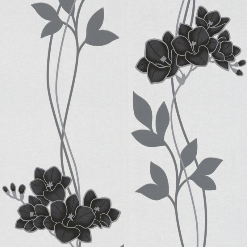 Again we went on the advice of friends that B&Q was the best place to go for wallpaper, in terms of availability, variety and price. We both liked the idea of a feature wall on the main wall but were also aware that we didn't want to go too over the top as the sofa's already had a pattern on them. We bought all the samples home and stuck them to the wall which we wanted to be our feature wall. Out of the 6 or so samples we both decided what one we liked the most and lucky for us it was the same one; Super Fresco Easy Serene Wallcovering Black so I went out the very next day and bought three rolls!
Paint:
We went on advice from friends that the best place to go for paint was Wickes as they are owned by Travis Perkins and are therefore trade quality and one of the least toxic on the market. Another friend also advised me to look at all the paint brochures I can for inspiration as they are the best place to see what colours will actually look like on the walls. I found this image in the Wickes catalogue and instantly liked it:
This colour pallet is referred to as Urban Nation: "The colour palette for Urban Nation consists predominately of an array of olive greens, greys and blacks, each representative of part of the urban landscape.
The above image shows walls painted in Clay."
Now if someone had said to me a year or so ago that I would one day have a grey living room I would have called them crazy! But having the grey and pink sofas to work with has really opened my eyes to how many shades of grey there actually are. I liked this one instantly as it is so warm that it actually makes the sofas in turn feel cosier also. I also really liked the contrast between this sort of grey and the white wood work. I would advise anyone, especially if you're fairly new to buying interior paint as we are, to go and get samples and paint them on all the walls you intend to paint on, only then can you see if the paint actually goes with your room, with the light, as all walls have different light and it is so important to make sure your choice of colour works in all the different lights in that room.
The colour which I liked so much on the walls in the above photo was actually called Clay:
 ...but when we tried this out on our walls in the living room it just looked far too dark so we went for a lighter option in the end called Pebble which gives a very similar effect to the photo above but doesn't darken the room at all.
 Wallpaper:
 Again we went on the advice of friends that B&Q was the best place to go for wallpaper, in terms of availability, variety and price. We both liked the idea of a feature wall on the main wall but were also aware that we didn't want to go too over the top as the sofa's already had a pattern on them. We bought all the samples home and stuck them to the wall which we wanted to be our feature wall. Out of the 6 or so samples we both decided what one we liked the most and lucky for us it was the same one; Super Fresco Easy Serene Wallcovering Black so I went out the very next day and bought three rolls!
 LIVING ROOM: Sofas & TV upgrade
TV and Sofa upgrade.....
These two purchases ended up being the most important in defining the room..... as before we got them our TV was second hand and very cumbersome and our couch was single and a bit saggy round the edges - both items had been bought on a budget when we first moved in together and it was time to upgrade.
When we got to the sofa store I had a very clear idea of what I wanted but my other half hated both of my choices... well you live and learn... best to go into such a varied selection without a set idea of what you want and really think about each option. We found one which he liked the style of but I didn't like the pattern of as there were too many patterns on:
...even looking at it now I can't believe its the same sofa - and I wouldn't pick it from the above image either! But then the sales guy came over and said we could pick whatever selection we wanted from the pattern available and I was sold! So we picked the ones we both liked and we ordered them along with a cuddle couch to match:
We took these photos in the store both to make reference to whilst we were waiting for them to be shipped and partly because I don't think either one of us believed they would get the right colour combination. I am very happy to say that we were happily proven wrong on this.
Which we only managed to get £10 for when we sold, even though it was in perfect working order for what it was (this is why technology is not my department - I just find it so sad how quickly items loose their value)
To this:
 |
| LG 47" delight! It is, honestly, amazing how quickly it feels normal to watch TV on a screen so big and the room can take it, so we are both very happy with the result! |
LIVING ROOM: Curtains
They hadn't left us any curtains anywhere in the house, other than one old pair in the back room so I got on eBay and managed to get curtains for every room in the house for no more than £25 per pair. eBay is a resource which I use more than almost any other for everything from clothing to homeware - you really do get fantastic bargains and you can also make money too. I urge you to give it a go.
(photo to follow)
The specific curtains which I ended up with for the living room fitted perfectly both in length and width without taking any measurements they are a suede fabric on the top panel and a waffle fabric below. Against the cigarette stained cream walls, before we decorated, we were both concerned about the colour being too yellow, but supprisingly enough when they are against the pebble grey which we now have they look just perfect and we are both very pleased with the result. It is always worth waiting till the room is finished before dismissing any individual pieces for their colour for this very reason.
LIVING ROOM: Fireplace
This fireplace was the feature focus in the previous owners layout, and as it was placed at the centre of the room and we do have a chimney outside we made the presumption that we would be able to change this to a real fire (something I have always dreamed of) with relative ease. But this was not to be the case as the chimney on the property was not to service an open fire but a backburner (which I believe was some sort of old fashioned boiler) the chimney breast was therefore not situated in the middle of the room but right in the very corner. The fire was just an electric fire and had no connection to the chimney at all. Still I did manage to sell both the fire and matching mirror on eBay for a nice little profit and we have concluded that the dream of having a open fire will just have to wait till we can afford, and have room for a log burner in the future.
Aga Little Wenlock Classic SE Woodburning Stove @ £619.00 from Stoves are us, Fireplaces are us
or
Dovre 425CBW Wood Burning Stove @ £1035.00 also from Stoves are us, Fireplaces are us
This one seems remarkably better value than the others, and looks very nice indeed:
Firefox 5 Cleanburn Woodburning / Multi-fuel Stove (£399.00)This one is nice for something a bit different and a bit more modern, I also like that there is a place to store logs:

Amesti Nordic 350 Wood Burning Stove (£539.00)
But in any case it's more than likely going to be at least 10 years before we look into them for real.
BATHROOM: Funky Glass Dispensers
Would like to replace the grotty branded plastic bottles of shampoo, conditioner and shower gel with some nice funky dispensers, preferably glass. Here's some ideas which I have found so far:
Careo recycled glass soap dispenser @ £5.25 each from BiomeLifestyle - yet another shop which is new to me but looks lovely. Even better as they are recycled glass too.
Recycled Clear Green 450cc Glass Dispenser Bottles (Pack of 2) @ £20.56 from Overstock.com
MASTER BEDROOM: Beautiful Beds
This is more of dream for the future for now.... but still here are my favourites:
Antoinette - £745 for the double from The Sleep Room
Coco - £595.00 for the double from The Sleep Room
Louis - £745 for the double from The Sleep Room
Provencal Linen Upholstered Bed - £995.00 for the double from The French Bedroom Company
Highgrove Bedstead - £99.00 for the double from Dreams
Zoe Bedstead -£249.00 for the double from Dreams
Glacier Bedstead - £679.00 for the double at Dreams - if you want a bit of a fairy-tail
Henrietta Standard Bed - £1,385.00 for the double from Feather & Black
Oliver Bed - £299.00 for the double from Feather & Black
LIVING ROOM: From their home... to ours....
This was our challenge; to complete the Living Room in time for Christmas. It took an awful lot of planning, more than anything else physical preparation (by which I mean getting the walls to a decent enough state to paint and paper) and a ton of decorating too....
In September 2010 when we moved into our house the Living Room looked like this:
As you can see it didn't take us long to fill the room with random stuff from the move.....and we had a long way to go in just 3 months....
THIS is what we achieved.....

In September 2010 when we moved into our house the Living Room looked like this:
THIS is what we achieved.....
Lessons we have learnt along the way.....
- Decorating is at least 80% in the preparation and a small percentage in the actual decorating
- It is definately worth stripping walls, especially old ones, right back and getting them lined professionally. That way when you come to redecorate in 10 years time or so you will have a good basis to work from.
- Lining paper should go on horizontally and then the cracks should be filled in with polly filla and sanded before painting for the perfect finish.
- Wallpapering is a professionals job.
- Have one inspirational piece for every room you do and base your colour scheme around it.
- Decorating all the walls, if your on a budget, creates the effect that you have completely decorated a house. You can then go round again once the walls are done and update the floors and re-plaster the ceilings as and when you can afford it.

Tuesday, 28 December 2010
FUTURE ROOMS: Nursery
Here is my Pinterest Board of all things kids and family.....
Really cute girlie room, especially for the girliest of girls featuring Blowing Cherry Blossom Branch - Baby Nursery Wall Decal, idea from an etsy shop surface inspired.
Just found another gorgeous room at Like it Love it - I think it might be my favourite yet, the use of personalised wallart, funky fabrics and done up second hand furniture here is just beautiful, I can definately imagine doing something similar one day! I love it so much I'm post almost all the photos:


18/5/11
Just found another absolutely stunning room, this time by Shelli from A La Mode, who's room was featured on remodelaholic.
Nicole @ Making it lovely has just published photos of her new baby's Nursery and again it is just lovely...

Subscribe to:
Comments (Atom)


